


God is on the move...
Look at what happened in Kansas this past week!

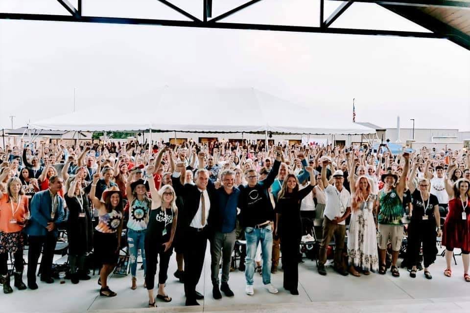
I have so much to share about this amazing event — Freedom Revival in the Heartland — that took place here in Kansas this past Tuesday. I am on the board of Kansans for Health Freedom that planned this event and it was done in only 3 weeks! God put an idea in a young mom’s heart, then she joined up with a local chiropractor, and then they asked Kansans for Health Freedom to join them in organizing this event. Wow! Did God show up!
From the very beginning we had to step out in faith. We had some big financial commitments that were going to have to be met, we had no idea how many tickets we would sell (hopefully enough to cover the expenses), and how many speakers we would agree to come.
God just blew us away with His faithfulness! We had so many speakers, we actually had to turn some away. We SOLD OUT of tickets, with tickets only being for sale to the public for about 1 week. I could go on and on with the stories of how God showed up, how He provided, how He paved the path for this event.
We never dreamed that such big name speakers like Del Bigtree, Andrew Wakefield, Bobby Kennedy, and many others would take the stage at our event. We had around 1,000 people attend, who came not only from Kansas, but from all over the US.
As a board, our passion is not only for health freedom, but for revival across our land. I thought it would be fun to share the history behind the logo that was created for the event by a couple ladies on our board. They did an amazing job!
Here is the information about our logo that was in our event booklet:

The Freedom Revival in the Heartland Logo
Logos are far more than a simple image. They evoke mood and emotion - they bring together elements of an event’s inspiration - they communicate a vision - they paint a picture of the heartbeat behind an event – they STAND for something!
Our Freedom Revival in the Heartland logo is no exception. An extraordinary amount of design, thought, heart, and prayer went into it. (Perhaps too much – ha! – but we felt a sense of responsibility to get it juuuust right). With all that is behind and within it, we wanted to share its inspiration with all of you.
The Event Name –
“Freedom” has always been at the core of this event. However, the word “revival” came later. The original title was “Freedom Rally in the Heartland.” Yet this event felt so much BIGGER than a rally. The word “revival” was brought to the table, confirmed over and over again through prayer, and STUCK!
The State Outline –
Read through the Kansas history page of this booklet and you will begin to understand why Kansas has been proclaimed and preserved as God’s “heartland.” We have such a rich, powerful history of strength, freedom, and standing for what is right. Many people, tribal nations, churches and other groups have been praying for Kansas for generations, and that continues strongly even today.
The Sunflower / Sun Outline –
It is no secret that the sunflower is the Kansas state flower. However, you may not have realized how special sunflowers truly are. Have you ever tried to pull a sunflower up from the ground? It is nearly impossible! They are incredibly STRONG, deeply ROOTED, stand TALL, are full of LIFE-GIVING (and delicious) seeds, reach HIGH into the sky, and also just so happen to be yellow - the designated color of the health freedom movement.
And yet, as important as sunflowers are to us here in Kansas, the logo inspiration extends even further.
While preparing for this event, many of us kept feeling that this initial event in the center of our nation is meant to spark something WAY bigger. Therefore, the Kansas sunflower was transformed into even more of a sun – as if to portray the light of freedom, truth, healing, and love reflecting and radiating out from God’s heartland to the rest of the world. We hope this event will serve to light a candle for other cities, states, and nations to feel inspired and do the same.
The Arrow –
The arrow is multi-faceted and one of the most mysterious parts of our logo. Even the events team is still learning more about it as God continues to reveal to us what He had in mind for its inclusion! From the beginning, we had a strong sense that Native American symbology was destined to be a part of our logo. (Again, read our Kansas history page to learn more about that). Several images were considered, including Wichita’s iconic Keeper of the Plains. Then, the arrow emerged. The arrow unmistakably points up – reaching to the heavens, revealing true north, and providing hope as if to say “onward and upward we go, TOGETHER!”
The Seal –
The logo, and all the meaning wrapped up in it, is then stamped with a final seal. Seals give an image authority and stand as an official emblem, a mark of identification – the perfect finishing touch to the multi-faceted and inspirational icon for this event.
I can’t wait to see what God is going to do, beginning right here in Kansas!
Are you enjoying these little “extra” posts or emails from me? I hope so! I know I am just beginning, but so far it has been a fun way for me to jot down things to share without all the worries about tech stuff :). Remember that you can comment on any of my posts too!